Mobile Albums
You can access all your albums from any mobile device with a browser!
- Go to Viewbook.com in Safari on your iPhone or iPad or Chrome on your Android device.
- Tap the hamburger menu at the top right of the screen, and tap "login." It's the last item in the menu.
- Fill in your login details as you would on your computer.
- Once you are logged in all the albums in your account will be visible.
- iOS - Tap the share icon at the bottom of Safari. That's the one that looks like a square with an arrow through it.
Android - Tap the three vertical dots next to the address bar. - iOS - There are two rows of icons. The top row represents apps and the bottom (grey) represents actions. Find "Add to home screen."
Android - "Add to home screen" is on of the options in the list that appears after you click the three vertical dots next to the address bar. - Tap "Add to home screen."
An Icon will be added to your desktop, and by tapping it you can quickly access your albums whenever you like without intrusion from the address bar or browser navigation.
Viewbook on Mobile Phones
Looking at and navigating a website on a small screen is an entirely different experience than doing the same on a full-sized computer. Instead of a mouse and keyboard, you rely on touches, taps, and fingers to navigate, and reading text can be difficult if the proper adjustments have not made. When you open a Viewbook site in a smart phone browser, a different streamlined version of the desktop site you designed will load. Navigation and text have been optimized for use and legibility on small screens. Images display brilliantly and load swiftly. Also, Viewbook sites comply with Google’s mobile guidelines, so there will be no SEO penalty.
Enable Mobile Sites
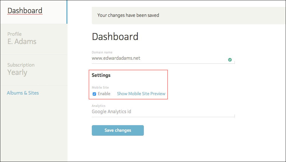
Go to the “Dashboard” and check “Enable Mobile Site” in the site preference section. You may always switch back if you choose, but be aware that using the old version may impact your SEO.
Known Issues
All normal pages will translate very well into Mobile pages, with a few exceptions. Working on the details is an ongoing process, and we encourage you to send us your thoughts and observations.
- Pages with custom HTML, or "splash pages" with an "Enter site" link may not display well.
Adjust the HTML or remove the "splash page." Set one of the other pages in your site as the homepage. - Logo added as background image does not scale properly.
Remove the background image and upload a logo that conforms to our specifications. - Background images used as design elements (lines, patterns, etc) do not scale properly.
Remove the background and/or rethink your background image strategy. - Menu or other text isn't visible when a background image is used.
Change the font color or choose a different background. - The 'Side title' and 'Side text' are not displayed on mobile.
This is unlikely to change in the short term.
Frequently Asked Questions
Are your websites optimized for mobile display?
Yes! New accounts display the optimized mobile site by default. If you have an older account (before April 2015) you may need to activate the optimized mobile view in the Dashboard. Click on the "Enable" button under Settings / Mobile Site.
Can I edit my site on my mobile phone or tablet?
No.